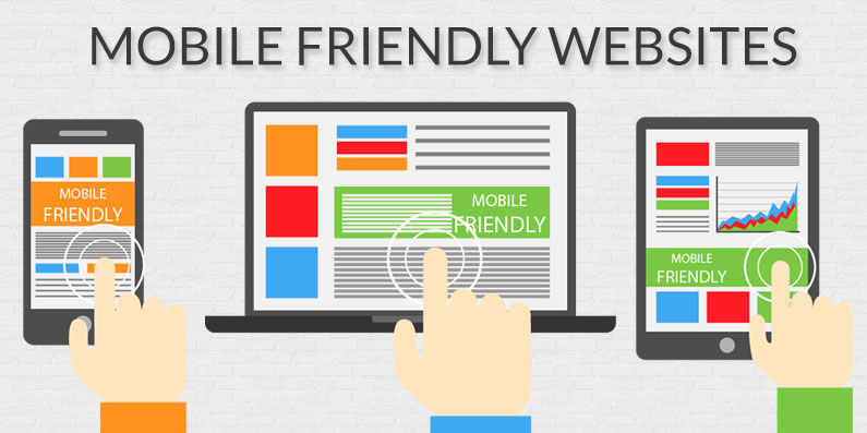
WHY TO HAVE A MOBILE-FIRST APPROACH?
With no doubt there is huge talk on “Mobile-first” by digital marketers, as well as, website designers and developers. But how many of us actually understand its meaning and worth?
India is the second largest online market with over 460 million Internet users. Study reveals, Internet penetration rate in 2015 was 26% as compared to 2011 at about 10%. It might astound you, but the fact remains, India has emerged as world’s fourth largest mobile app economy.
Mobile first approach is mistakenly taken as prioritising a specific target audience over another, however this isn’t the case. It’s quintessential to understand that the mobile Internet users are no different than the desktop users they are most often the same.
Mobile first is far beyond discriminating amongst your audiences. It has more to do with the first impressions and the whole user experience on your website – right from entering your site to final conversion and beyond.
Mobile first is about designing, developing and marketing for a great mobile experience first and then scaling it to other devices that your target audience is using.
Mobile first is about keeping pace with ever-evolving technology and user behavioural patterns so you can interact with the potential users at each key touch points.
According to the latest studies, there is a considerable hike in people interacting on social medias, checking emails and searching information using mobiles. They might later switch to some other device like a laptop or a desktop at work but tend to begin their online activity from mobiles.
It is said and believed, first impression is the last impression so if we are to go with this concept, if your first impression on mobile is poor realistically you have probably lost that user’s interest and missed-out on a potential lead or conversion.
With no doubts, there are still organisations that witness a high desktop/laptop visitor demographic, but believe me; it is in decline every passing day.This is because unlike laptops, which have a large landscape screen mobiles screens are of course smaller and tend to be used mostly in portrait.
Ensuring that the key elements are at front and centre is not always easy, it requires a lot of planning and skills. It starts from defining the purpose of the website “Why you want a website” and “What do you want to convey your through it”.
While some website designs can be successfully made mobile responsive, the experience can be less user-friendly on mobile if this wasn’t originally considered.
Today, a gigantic 60% of Internet traffic comes from mobile devices. It is estimated that the amount of shoppers using mobile devices rose to 35% in 2014. So if you don’t have a mobile friendly website, you may have say goodbye to a lot of potential users!
In 2015, Google rolled-out it’s algorithms that expanded its use of ‘mobile-friendliness’ as one of its ranking factors. This means that a lot of websites out there could be hit pretty hard in the mobile search results.
Google considers Bounce Rate in its ranking evaluation. Bounce Rate is when a user either leaves the site without going through to another webpage of your website. In 80% of the websites it’s bad if the Bounce Rate is high, whereas in 20% of the cases higher the bounce rate the better it seems to be.
Now, if the website is not mobile friendly there is a high probability of higher bounce rate for your website for simple reasons like – your website may take more time to load on mobile, the content might not be clear, the structure may appear to be “hayway” a
- 20th JULY 2020